ADVERTISEMENT
Why One McDonald’s Has Turquoise Arches! – Story of the Day
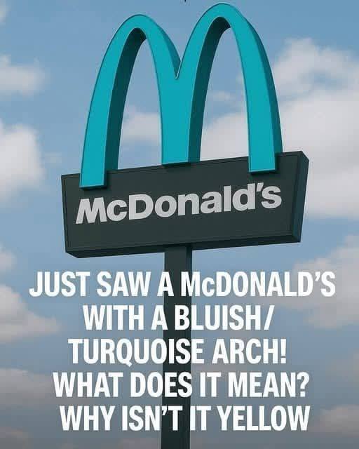
When most people think of McDonald’s, a golden “M” gleaming in the sunlight immediately comes to mind. It’s an icon recognized in nearly every corner of the globe—a symbol of fast food, convenience, and childhood nostalgia. But what if I told you that there’s a McDonald’s somewhere with turquoise arches instead of gold? That’s right—one of the most iconic brands in the world broke its own rule, and it’s not just a design quirk. Today, we’re diving into the story behind this unusual color choice, the fascinating history of McDonald’s branding, and what it all tells us about how companies respond to their communities.
The Discovery: A Turquoise “M” Among the Gold
It all started when social media users began sharing photos of a McDonald’s in Sedona, Arizona, with arches that were distinctly turquoise instead of the familiar golden yellow. At first glance, it seemed like a quirky mistake. “Did they run out of yellow paint?” some joked online. But for locals and observant travelers, the color change had a deeper, more meaningful reason.
Sedona is famous for its stunning red rock formations and scenic landscapes. The city has strict building codes aimed at preserving its natural beauty. Buildings are required to use colors that blend harmoniously with the environment—no glaring neon yellows or stark whites allowed. In other words, this turquoise “M” is a clever compromise between the iconic McDonald’s brand and the city’s environmental standards.
A Brief History of McDonald’s Branding
To understand why turquoise is such a striking departure, we need to look at the history of the golden arches. McDonald’s first introduced the arch-shaped logo in 1961, inspired by the architecture of early McDonald’s restaurants. Over the decades, the golden “M” became more than just a logo—it became a global cultural icon.
The choice of yellow was deliberate. Psychologists and marketers note that yellow evokes happiness, energy, and appetite, while red stimulates hunger and urgency. Together, the red-and-yellow combination has become synonymous with fast food.
So when you see turquoise instead of gold, it’s not just a different shade—it’s a radical break from decades of marketing psychology.
Why Turquoise? More Than Just Aesthetic Appeal
In Sedona, every building must respect the natural color palette of the region. The turquoise hue was chosen because it blends with the earthy reds and natural greens of the landscape, offering a subtle nod to the golden arches while keeping the restaurant visually unobtrusive.
It’s a fascinating example of how global brands adapt to local contexts. Most people assume that McDonald’s is identical everywhere, but in reality, the company has a long history of tweaking designs, menus, and operations to respect local culture. From halal burgers in the Middle East to green tea McFlurries in Japan, McDonald’s adapts more than you might think.
